Australia's Next Generation $5 Polymer Note - Can Dunny Brushes Really Be A Technological Breakthrou
The Reserve Bank of Australia (RBA) threw the internet into meltdown on April 12th when it revealed the designs of the first note to be released in their Next Generation Banknote (NGB) Project, the $5 note.
I wasn’t working in the numismatic industry when our current series of banknotes was introduced into circulation, between 1988 and 1996, however the level of media interest in the launch of this note was far higher than I’ve experienced relating to any Australian numismatic story in the past 20 years.
I was interviewed no less than 4 times by different ABC radio stations throughout the day on April 13th (Canberra, Sydney, Darwin and Geraldton).
That doesn’t include the amount of interest in the note on social media (not that the internet, much less social media existed in the minds of most people in the world between 1988 and 1996), which was alight with the initial reactions of many Australians to the designs on the new banknotes.
Despite the fact that the new designs show that the RBA and Note Printing Australia clearly continue to push the envelope when it comes to banknote printing technology, a lot of the vitriol was shot from the hip and hardly what one would call “considered”. Such is the world we live in today, and as pretty much everyone from children to the elderly now has a keyboard and access to the internet, and as opinions are like backsides in that everyone has one, the screens of social media were alight with fury casting aspersions on any number of aspects of the new $5 note.
Colour and the Queen
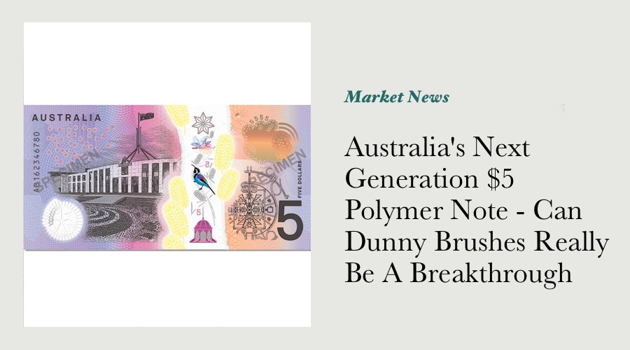
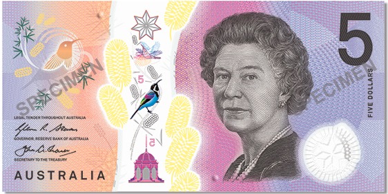
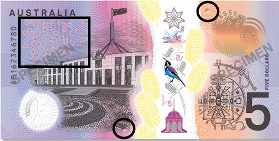
The main subjects of contention were that the Queen remained part of the designs, and the fact that the colour palette used on the note was much wider than on our existing $5 notes. The intriguing question I have is how has the RBA included the much-discussed tactile element within the design of the note?
Some of the comments on Facebook really are quite laughable (more than a few keyboard warriors said the spray of wattle in the middle of the back of the note looked like “Clown vomit”), whereas the folks on Twitter voiced such sophisticated comments as that it was "...clearly Tony Abbot’s last captain’s pick".
There’s no doubt at all that among my first reactions to the designs on the new $5 was that I immediately thought that the additional yellow flowers in the middle of the note were incredibly bright, and vastly more eye-catching than we’ve seen on any Australian note to date. My eye was also caught by the clear window that seemed to run right through the middle of the note, as well as the additional colours that could be seen in that clear window.
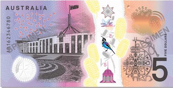
Splash of Yellow - Prickly Moses Wattle or Dunny Brushes?
We’d be foolish to think that RBA staff weren’t aware at all of the range of reactions that this splash of colour would elicit - after all, this project has been underway since at least 2007, and their own press releases describe how “Advice has been sought through a number of channels during the development process, including an advisory panel, subject-matter experts and focus groups comprising members of the public. These ongoing consultations provide an opportunity to ensure that the new banknotes meet the needs of the community.” I have no doubt at all that the feedback in some of those consultation sessions would have been “lively” to say the least.
The RBA has long telegraphed that bright colours are just one of the ways that it enables vision-impaired members of the general public to differentiate between the various Australian denominations: "As previously announced, existing features to help the vision impaired tell the difference between different denominations of Australian banknotes will be maintained on the new series. These include: bright colours; large and bold numbers; and different sizes for each denomination of banknote."
What I find interesting about this additional splash of colour is not that it has happened, but that it can now happen.
In years past, the range of colours seen on Australia’s banknotes (and indeed the banknotes of nearly every other nation on earth) has been quite limited - the colours featured will fall within a range of the colour spectrum, each different colour closely nested with the others used. This has been largely due to the technical challenges and costs associated with doing otherwise!
I think it’s incredible that NPA has developed the polymer printing technology to the extent where it is even possible to feature a wider variety of colours on our national notes. I find it interesting that there’s been so much blowback from the general public over this development, albeit blowback that has been concentrated on social media within the space of about 48 hours (until everyone moved onto the next thing to holler and shout about!)
This is particularly the case when we consider the general agreement that Australia’s currency notes are considered to be more “interesting” than the greenbacks of the USA, all of which are printed with largely the same colour scheme, no matter which denomination they are.
The Clear Window In the Middle of the NGB $5 - Is This Really a New Development?
If you’ve been keeping across our website for the past 12 months or so, you’ll be aware that I’ve been fortunate to handle a few of the rare polymer “Turbula” test notes, as used by CSIRO in the development of our polymer currency notes in the late 1970’s. Interestingly, those notes have a clear window that runs from top to bottom, however the security element (effectively a hologram) printed within that pane is far less complex that those we’re seeing on the NGB $5 note.
As those notes are now nearly 40 years old, the clear pane is clearly a security device that NPA has been keen to include for quite some time. I’d suggest the reason that it hasn’t been included on the Australian notes that have been issued into circulation so far is because of the technical challenges involved in ensuring that the design elements stayed on the clear pane after a few decades of circulation.
If we look at the NGB $5 note closely, we can see that not only does the clear window pane have a lot of print on it, there’s a wide range of colours in that window to boot. We can see blue, green and red in the birds in the centre of the note, while Sydney’s famous Federation Pavilion (in Centennial Park) is a rich purple colour. The entire reason polymer substrate is used for circulating currency notes is because of just how incredibly hard it is to print on. Reports from the RBA following a concerted attempt by a Colombian criminal cartel to counterfeit Australia’s polymer $100 note way back in 2006 stated that the notes “...were printed on plastic film, and contained high-quality reproductions of the design, clear window, white pattern within the clear window and shadow image.” This added complexity of fine detail and a wide range of colours will surely ensure that Australia’s polymer currency notes remain difficult to counterfeit for many years to come.
Should the Queen Still Be On Australia’s Banknotes?
My personal opinion is that so long as HM QEII remains as our head of state, then the tradition of her being on at least one of our notes should remain unbroken. That’s not to say that I don’t want to eventually see an Australian head of state at some stage - once those with their hands on the levers work out a constitutional model suitable to the majority and that majority votes in favour via a referendum. If we switch to a Republic at some stage in the future, then there’s no doubt a suitable replacement will need to be found. Until that day comes however, tradition says Her Majesty remains where she is!
Another aspect to the discussion surrounding the portrait of Elizabeth II being included on our notes is whether the portrait should be a more recent one, rather than one that was designed before 1992, and was “touched up” in more recent times. My understanding is that this approach to the way that all of the people on our NGB banknotes will be depicted. In the article written by Adam Shand back in September 2012 that broke the news of the NGB Project, he quoted one source as stating that “Designers were briefed to capture "characteristics of Australia" with "youthful" and "energetic design qualities". They were supplied with new portraits depicting the subjects on the notes at earlier moments in their lives."
More than a few people online pointed out that the polymer notes recently issued by New Zealand feature a far more accurate representation of how the Queen looks today, and that this was an appropriate approach. There’s no doubt that’s a fair observation to make, however if designers will be ensuring that Unaiapon, Reify, Flynn and the other highly-regarded Australians featured on our currency notes are to be rendered in a more youthful and energetic style, then it would surely have been out of place to include a portrait of the Queen that was less so.
All in all, given the incredible level of media interest in the new designs featured on the NGB $5, I believe the near-term future of the note market bodes well.
The Tactile Element, Just Where Is It?
One of the major developments the the NGB banknotes will be bringing about is a tactile element - the ability to tell what denomination the note is, based on how it feels. Although the RBA has been quite open about this new feature since it was announced in February 2015, they have been less open about just how that tactile element will be included. Although Braille notations included on the notes seems to be the most obvious choice, there are actually a number of other options that the RBA may have opted for instead.
Connor McLeod is the young blind boy from NSW who lobbied the RBA on behalf of the blind community to include a tactile element on our new banknotes, and whenever he’s discussed the idea, he’s mentioned Braille specifically. That said, he also mentions Canada’s currency notes, and the system they’ve implemented to enable vision impaired Canadians to determine which notes they’re handling. The Bank of Canada website states that they opted for a system of raised dots that isn’t braille for some reason: "The tactile feature consists of symbols of six raised dots (two columns of three) separated by a smooth surface. This system is not Braille. It was developed in consultation with blind and partially-sighted Canadians after research indicated that not all users read Braille."

Other countries such as Thailand have included Braille on their notes, while the UAE uses a series of lines to denote which denomination is which, as does India. Many, many other countries around the world have solved the same challenge in different ways.
The images released by the RBA of the NGB $5 note to date seem to indicate two raised dots either side, close to the middle along the top and bottom edges. That said, a number of the countries mentioned on those pages above have indicated that the life-span of significantly raised dots could be impractical if they happen to wear down with circulation over time. That said, there is a section on the upper left of the front of the note that features a series of dots, and I’m not convinced that there isn’t the braille number 5 hidden within it...
I’m convinced that the launch of the new $5 note in September is certain to increase interest in collecting decimal notes - the hand-wringing hysteria of the Twitterati will fade once everyone learns just why the RBA made the decisions that it did, and people will get back to relating to their banknotes just as money!